 HammBurg Be informed with latest news, reviews, entertainment, lifestyle tips, and much more.

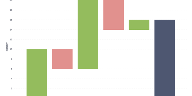
Waterfall charts are a unique data visualization tool that can effectively present a series of positive or negative data changes. It can provide an understandable summary of the cumulative effect of sequential data. The effective use of this tool can create a significant impact, such as identifying data trends and patterns and setting compelling storytelling for your audience. It also allows the audience to connect more meaningfully with the data, making presentations more impactful. In this article, we delve into the fundamentals and complexities of creating and using waterfall charts.
Understanding the Core Concept of Waterfall Charts
The primary concept of a waterfall chart, also known as a bridge chart, begins with illustrating an initial value and ends with a final one. Between these, several adjustments either increase or decrease this value, visualized by floating columns or bars. This shape, in a way, is similar to a cascading waterfall, hence its name.
The waterfall chart is an effective means of visualizing a series of positive and negative changes to an initial amount, providing more details for each change and its culminating effect. They are usually based on categorical data: time periods, different groups of items, various steps in a process – anything that can be sequentially ordered.
Waterfall charts are aptly suited for a variety of uses, including financial analysis, inventory reports, survey responses, and project management, to name a few. They provide an overview of where increments or reductions have occurred, facilitating swift comprehension and analysis.
Essential Components of a Waterfall Chart
The waterfall chart, at its basic, is composed of a vertical axis that represents the values and a horizontal axis that shows the categorical items. The columns are unique because they float, which means that their bases could start at the middle, top, or bottom of the chart, depending on the value they represent. By floating, these columns can accurately depict the increase or decrease in values.
There are typically three types of floating bars in a waterfall chart: Increase, Decrease, and Total bars. In essence, each of these bars represents the various adjustments that occur from the initial value leading to the final state. The use of color coding for these bars can further highlight the different movements and roles of each bar.
A well-structured waterfall chart will also feature labels at the end of each column to help audiences understand the values and components contributing to the cumulative total. Notably, these labels can enhance understanding by making the details of the chart clearer.
Lastly, important components in the setup of a waterfall chart include the initial and final values. These are usually represented by bars anchored to the baseline, filled to the value point. They act as references, bookending the changes presented in the chart.
The Importance of Waterfall Charts in Data Visualization
Waterfall charts rank among the most potent instruments in the data visualization toolkit. They give a visual ‘story’ of the changes in a value from an initial state to the final one, unlike other types of data plots. It gives each change a visual representation, making it easier to follow the cumulative effect these changes have on the end value.
Articulately presented waterfall charts have the added advantage of making data more consumable for all audiences. This is especially valuable when presenting complex data relationships and summaries to a non-technical audience.
It’s important to remember that a well-crafted waterfall chart, in its simplicity and depth, can communicate complex datasets effectively. This can, in turn, incite discussions, drive data-driven decision-making, and inform strategic planning efforts in any organizational setup.
Conclusively, the power of waterfall charts lies not only in their aesthetic value but also in the clarity and depth of analysis they bring to any conversation involving data.
Altogether, the complexity of waterfall charts should not overshadow their profound capacity for capitulating detailed insights from a sea of data. With the right understanding, strategies, and tools, this data visualization powerhouse has the potential to significantly enhance business analysis and decision-making. So, why not give waterfall charts a chance as you continue to exploit the bounties of data visualization?