 HammBurg Be informed with latest news, reviews, entertainment, lifestyle tips, and much more.

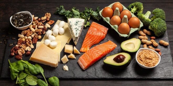
Covid has become a hanging sword above us since the year 2020. It has had a massive impact on health as well as finance. Realizing the importance of good immunity, we have started eating healthier because we believe in the slogan.
Prevention is better than cure!
This gives you an excellent opportunity to grow your brand that sells or manufactures healthy food. Let me ask you something. What do you think of when I say, Mcdonalds? You think of a burger in red and yellow colors! What does this mean?
We identify brands with their logos. Even if we do not know anything about the companies or their whereabouts, we do remember them by their logos. It is high time that you, as an entrepreneur, read the significant ways to design Healthy Food Logos.
This article will help freelancers and logo designers as well. Here are some best ways to designing healthy food logos:
1. Think of something organic and natural
Without any doubt, your Healthy Food Logo Design must contain some healthy fruits or vegetables. If you deal in a single healthy product, you can prepare a logo showing the raw ingredient of that product.
For instance, flour companies sometimes use wheat to convey the message. A Fruit Juice company can use some natural fruits in their logo. Quite often, fruits and vegetables are being used to highlight health.
2. Scan your competitors
Remember Porter’s five forces model? Alright, let me not bother you with some technical keywords. It just means that you need to be aware of what logos your competitors are using.
The logos must not be similar. This makes it difficult for people to make a line between the two brands. Think out of the box and try to design your healthy food logo as differently as possible.
3. Color
It would be an understatement to express that color is the most crucial part of your logo. In the food segment, what makes your logo aesthetic and meaningful is your color. Now the question arises,
What color should you use?
Remember the first tip when I said you to think organic? You got your answers now. You can choose or combine green, yellow, brown, a combination of red with other organic colors, muted blues, and so on. The color combination should be such so as not to hurt the eyes. Earthly hues can do the magic.
4. Font
Do you know that a simple sans serif font will suffice? Your objective of creating a Healthy Food Logo is to convey your business values to a customer. The simpler the font, the better it is. Of course, you are free to try and experiment with different fonts available. However, keep in mind that the font should not include cursive and illegible writings.
What about the font color?
The font color depends on the color background you have chosen in the above tip. White color does fairly well in contrast with earthly colors.
There is no straight-jacket formula to design a logo with a particular color combination using the color wheel. It all depends on what suits our eyes. However, avoid hues that are complex and difficult to digest.
You want your healthy food logo design to look as natural as possible and not some artificial piece of design!
5. Size of your Healthy Food Logo
Your logo size matters more than you think. An oversized logo will not only take up space everywhere but also leave empty spaces which can get out of proportion. Your logo may be framed in a square or a circle, or some custom frame. If the frame is large, the contents within it look small.
You must ensure that your Healthy Food Logo Design has a good shape and is not out of proportion.
6. Synchronization
Do not worry, as this is nothing complex. It means that everything should be in harmony. The illustration that uses in your healthy food logos should match what you are offering.
If you specialize in an omelette, you can have an egg as your illustration. If you are offering some Italian cuisines, then pasta would be your best bet. If you are into Chinese, then you should definitely use chopsticks as your logo’s key elements in corel cad. Your objective is to portray your business’ personality in the logo itself. Have you seen how bakeries use cakes?
7. Do not change your Healthy Food Logo Design frequently
This is a word of caveat. It can happen that you may expand your business to include some other health potions as well. However, not every expansion warrants a change in your logo.
Apple has not changed its logo even though it is venturing into various technological spaces. Similarly, you need to make sure that your apple does not become a mango tomorrow.
People will fail to recognize you, and ultimately your business will be doomed.
8. Your company name
This tip here should be read along with the font tip. Talking about spacing your Healthy Food Logo, it should have sufficient space to house your brand name. If your brand name has a collection of words, it can be placed all horizontally!
One word in one line is preferred. However, in such cases, you need to experiment with the positioning of your company name in the logo. If your illustration is a leaf blower, you cannot embed your name in such a way that one camouflages the other.
9. Trial and Test
Your Healthy Food Logo is such an important part of your brand building. You are going to use this on your website, product, magazines, leaflets, restaurants (if you have one), and so on. Do not attempt to release your logo at once.
You can share your drafts on social media to seek approvals. The one with the best vote wins. Even if you do not want to share it initially, you can ask your friends and relatives about how they feel when they see your logo.
Lastly, never make your Healthy Food Logos look irrelevant, or else your business will get into trouble.
Final thought!
If you want help with logo designing, you can seek help from the best Logo Design Company in Mumbai.
Best of luck!